
Opinion
A Tale of Two Banners: The Evolution and History of the Utah State Flag
Flags are usually static things. Once a state adopts a design, it tends to stay that way for a century, gathering dust in the history books and waving reliably over the state capitol. But recently, Utah decided to shake things up.
The state has found itself in the middle of a massive cultural conversation about design, history, and identity. In March of 2024, Utah officially adopted a brand new flag design, while simultaneously demoting its traditional blue banner to the status of “Historical State Flag.” It was a move that sparked debates in living rooms and legislative halls alike.
To understand why this happened, you have to understand the story behind the symbols. A flag is never just a piece of cloth; it is a shorthand for the values of the people who fly it. Whether you are a vexillologist (a fancy word for someone who studies flags) or just a proud resident of the Beehive State, the evolution of Utah’s banner is a fascinating crash course in the history of the American West.
Here is a look at how Utah’s identity has been stitched together over the last 125 years, from the pioneer days to the modern era.
The Original Struggle: Statehood and the Seal on a Sheet
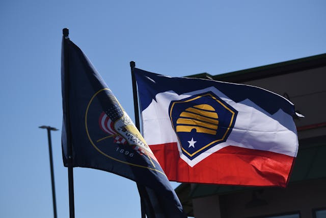
To understand the original Utah flag (now the Historical Flag), you have to go back to 1896. This was the year Utah was finally granted statehood after being denied several times by the federal government due to political and cultural conflicts regarding the Mormon settlers.
When statehood was finally achieved, the design of the state seal—and subsequently the flag—was all about proving loyalty. The pioneers wanted to show the rest of the country that they were Americans first.
This is why the traditional flag features a bald eagle so prominently. The eagle, perched on top of a shield, is ready to take flight. Its wings are spread, symbolizing protection. But if you look closely, the eagle is perched on six arrows. This wasn’t an accident. The arrows represent the six Native American tribes of Utah, but they also represent the power of war, while the sego lilies on the shield represent peace.
The most telling detail, however, is the American flags draped around the shield. This was a deliberate design choice to show that Utah was wrapped in the support of the Union. It was a visual peace treaty with Washington DC.
The Symbol That Stuck: The Beehive
While the eagle and the flags are standard American iconography, the centerpiece of the Utah flag—both the old and the new—is the beehive.
This is the most distinctly Utah symbol in existence. It dates back to 1847, when Brigham Young and the first Mormon pioneers arrived in the Salt Lake Valley. They called the territory “Deseret,” a word from the Book of Mormon that means “honeybee.”
The beehive wasn’t about insects; it was about industry. It symbolized a community that worked together, where every individual contributed to the greater good of the hive. It represented thrift, hard work, and perseverance in a harsh desert climate. Even though the U.S. government rejected the name “Deseret” and chose “Utah” (after the Ute tribe) instead, the beehive stuck. It became the state emblem and the central visual anchor of the flag.
The Sego Lily Symbol
Tucked quietly on the shield of the historical flag (and present in the themes of the new flag) is a small white flower: the Sego Lily.
This isn’t just decorative flora. It is a symbol of survival. During the infestation of crickets in the late 1840s that decimated the pioneers’ crops, food was dangerously scarce. The settlers learned from the local indigenous tribes that the bulb of the Sego Lily was edible.
During those lean months, families survived by digging up these bulbs. The flower was enshrined on the flag as a symbol of peace and divine providence—a reminder that the land itself provided for the people when they needed it most.
The 89-Year Mistake
One of the funniest footnotes in the history of the Utah flag is that for nearly 90 years, the state was flying the wrong design.
In 1922, a custom flag was stitched for a presentation. The seamstress, trying to make the design fit nicely, moved the year 1896 (the year of statehood) from the bottom of the shield to the center of the shield, right below the year 1847 (the year the pioneers arrived).
No one corrected it. For decades, flag manufacturers simply copied that error flag. It wasn’t until 2011 that the legislature finally passed a resolution requiring manufacturers to go back to the original 1913 design specifications. It serves as a reminder that history is often shaped by the people who show up and do the work—even if they get the stitching a little wrong.
The Modern Shift: The 2024 Redesign
So, if the old flag had so much history, why change it?
The argument came down to the principles of good design. The old flag fell into a complicated state seal slapped onto a dark blue background. From a distance, it looked almost identical to the flags of Nebraska, Kansas, Montana, and a dozen other states. It was hard to read and hard to remember.
The new flag, officially adopted in March 2024, simplifies the history into a bold, graphical language.
- The Hexagon: The central shape is a hexagon, representing the cell of a honeycomb, keeping the industry theme alive.
- The Colors: It features a jagged red line across the middle, representing the red rocks of Southern Utah and the famous slot canyons. The top is white, symbolizing the snowy peaks of the Wasatch Range in the North. The bottom is blue, representing the dark skies and the lakes.
This new design attempts to bridge the gap between the pioneer history (the beehive is still there in the center) and the natural geography that defines the state today.
A State with Two Flags
Utah is now in a unique position. It hasn’t erased its history; it has categorized it. The “Historic State Flag” (the blue one with the eagle and seal) will still fly during holidays and special occasions. It remains a legal symbol of the state.
But the new banner is the daily driver. It is the symbol meant for hats, stickers, and porches. It is a flag designed to be recognized instantly, a modern logo for a state that has grown from a pioneer outpost into a tech and tourism hub.
Whether you prefer the intricate, hand-painted look of the 19th century or the bold, graphic punch of the 21st, both flags tell the same story: a story of hard work, survival, and a community that sticks together.

